
Most SDR performance dashboards have the same KPIs. Calls, Connects, Conversations, Meetings Scheduled and conversion rates for each over day, week and month.
Nothing wrong with them. We use them too for our outbound SDR teams and they are excellent for spotting ups and downs in trends over time to identify when something has changed.
But to find breakthroughs – really meaningful insights that point you in the direction of step function improvement, try the scatter plot.
By eliminating time as a variable, scatter plots allow you to see how groups of like things (SDRs, for example) stack up against each other at a point in time, based on two variables you select.
You can create three simple scatter plots, with each point on the plot representing an SDR performing the same job in the same way as other SDRs plotted on the same chart. I recommend plotting performance against these common KPIs…
- Connect Rate vs. Conversation Rate
- Connect Rate vs. Demo Scheduled Rate
- Conversation Rate vs. Demo Scheduled Rate
Here are what these plots might look like…
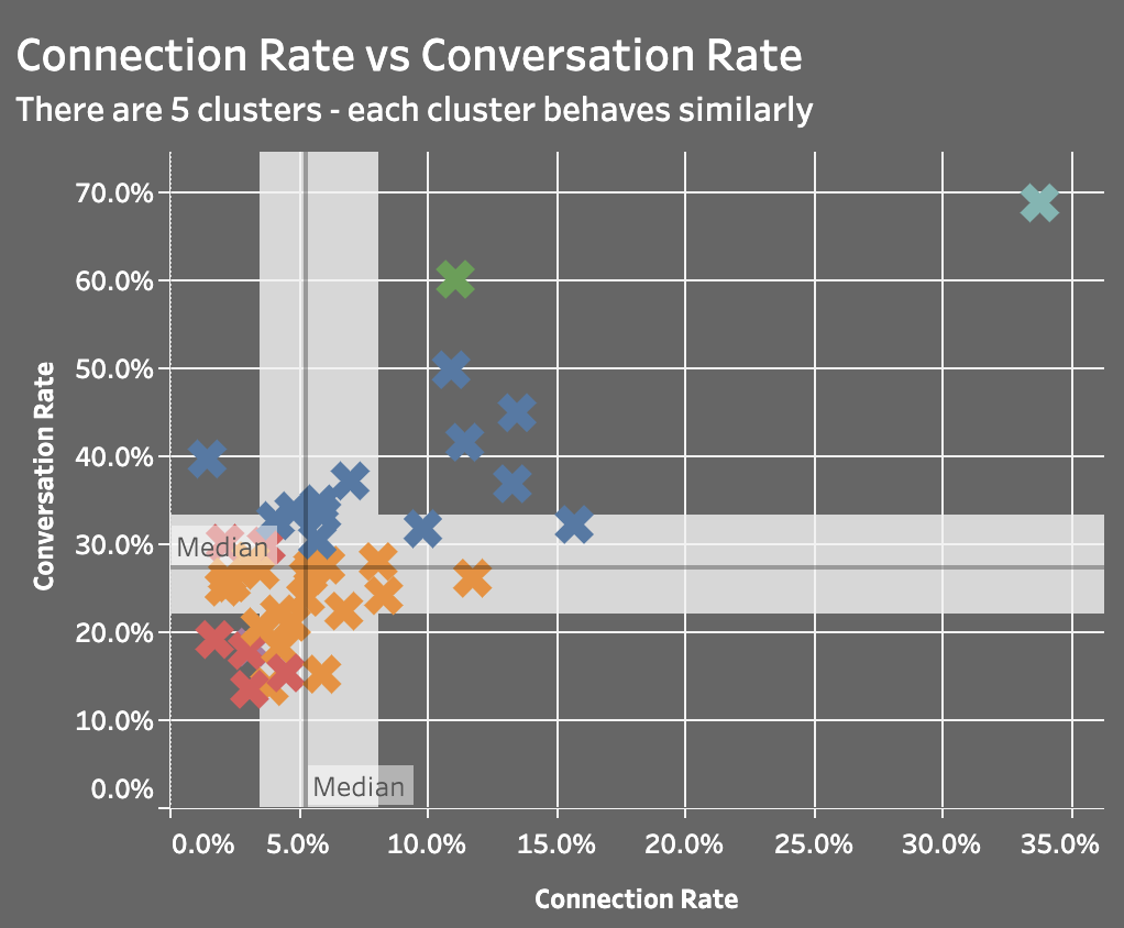
Plot 1: Connect Rate vs. Conversation Rate
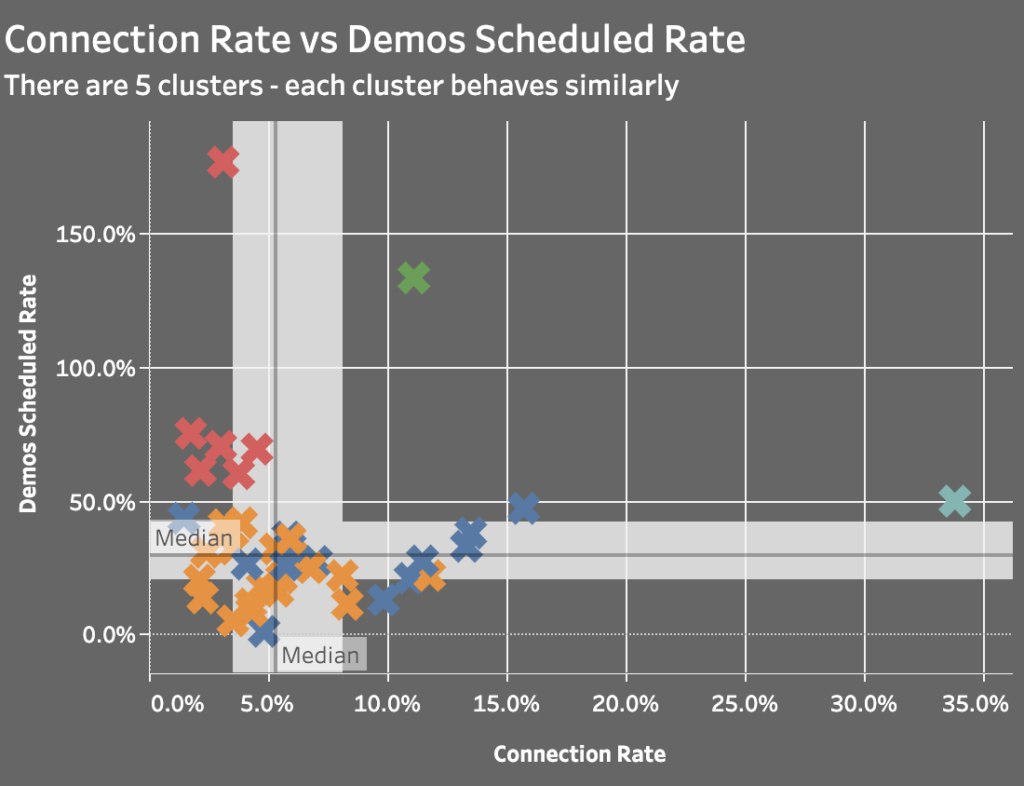
Plot 2: Connect Rate vs. Demo Scheduled Rate
Plot 3: Conversation Rate vs. Demo Scheduled Rate
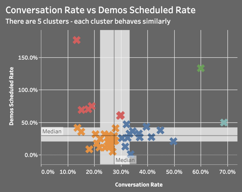
What will become almost immediately visible to you, without a lot of analysis, is how SDRs are clustered around certain variables. This provides valuable information when providing feedback to SDRs around performance, and also for creating tailored training and coaching for improvement.
For example, a high connect rate but low conversation rate relative to the group might indicate a need for call opening or objection handling training. Similarly, a high conversation rate but low demo scheduled rate relative to the group would cause you to think about the offer and close of the call as being an area of weakness. The key phrase is ‘relative to the group’. Nothing shines a light on relativity better than a scatter plot.
You can easily export a report from Salesforce to Excel and choose the scatter plot for Chart Type, or take advantage of recent integrations between Salesforce and Tableau to automate them, as we do.